🔍 Research
Before starting the design, thorough research was conducted to understand user needs, pain points, and the problem areas in the existing map design.
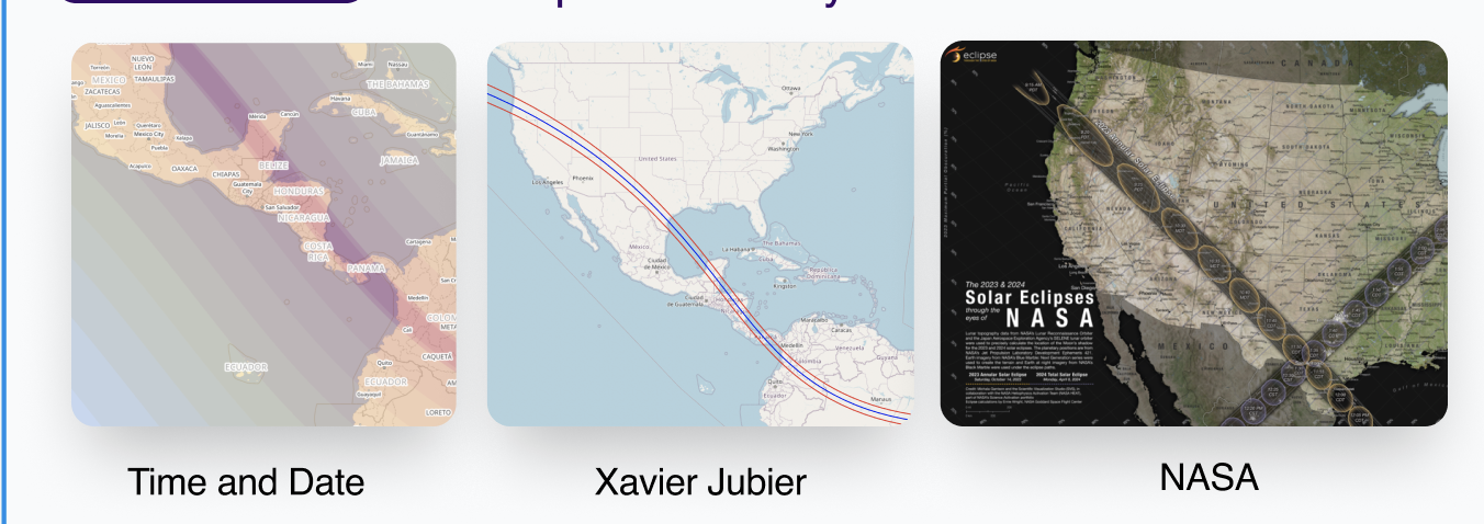
Research Insights
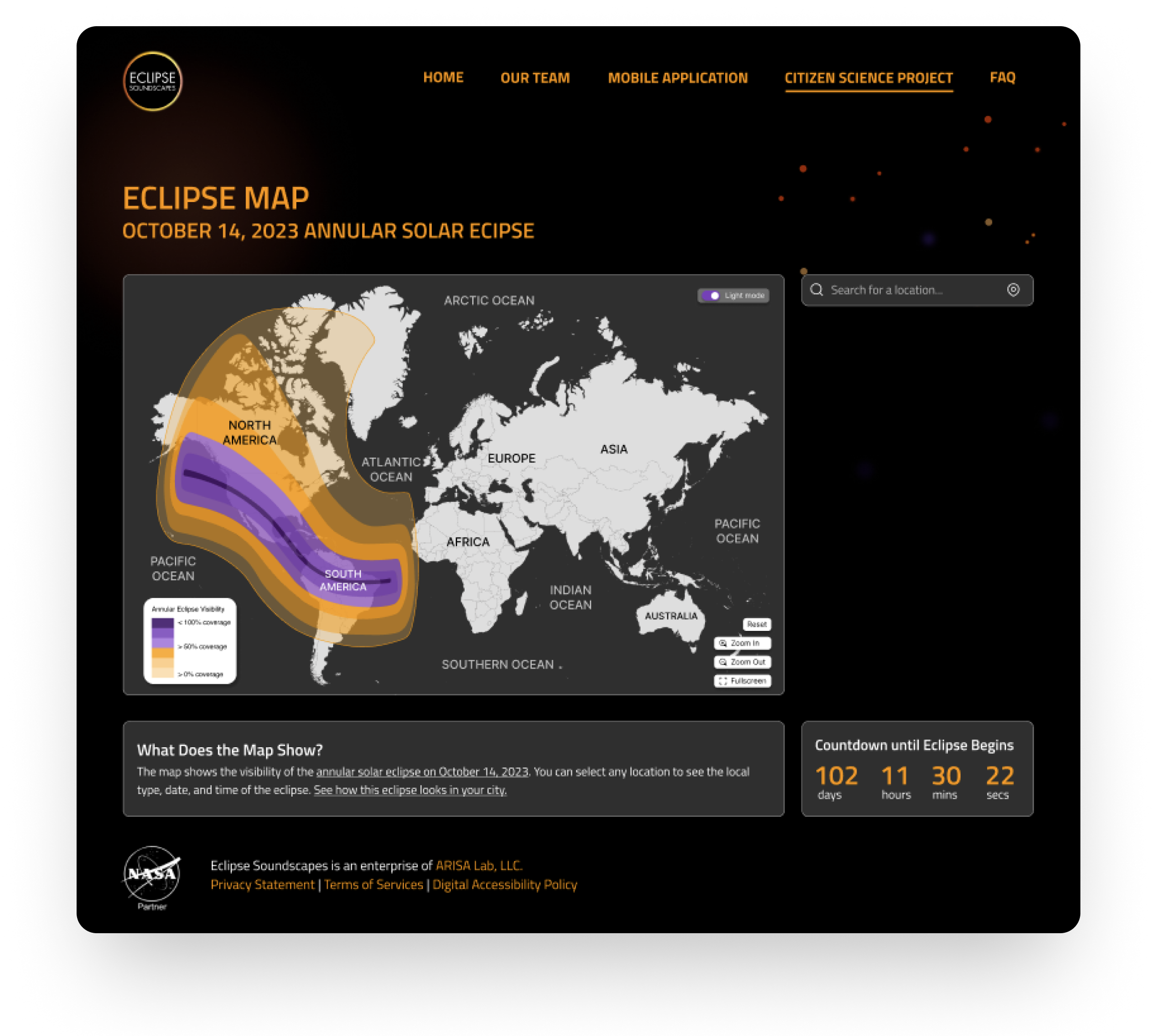
The goal of this project was to improve the accessibility and usability of NASA's Eclipse Soundscape Map by refining the user experience and interface design.
Before starting the design, thorough research was conducted to understand user needs, pain points, and the problem areas in the existing map design.
After gathering insights from research, I moved on to designing the wireframes and high-fidelity prototypes that solved the key pain points identified.
The high-fidelity prototype was created using Figma to demonstrate the interactive elements and final design of the mobile app. Below is the embedded prototype for the Eclipse Soundscape Map.
Accessibility issues - the grayscale, obscure fonts, and lack of alternative text descriptions.Visual clarity - Insufficient color contrast. Not allowing users to switch between dark mode and light mode.Not allowing users to adjust speed rate of screenreader.
"The new map is so much easier to navigate, and the accessibility features make a huge difference for me as a visually impaired user."
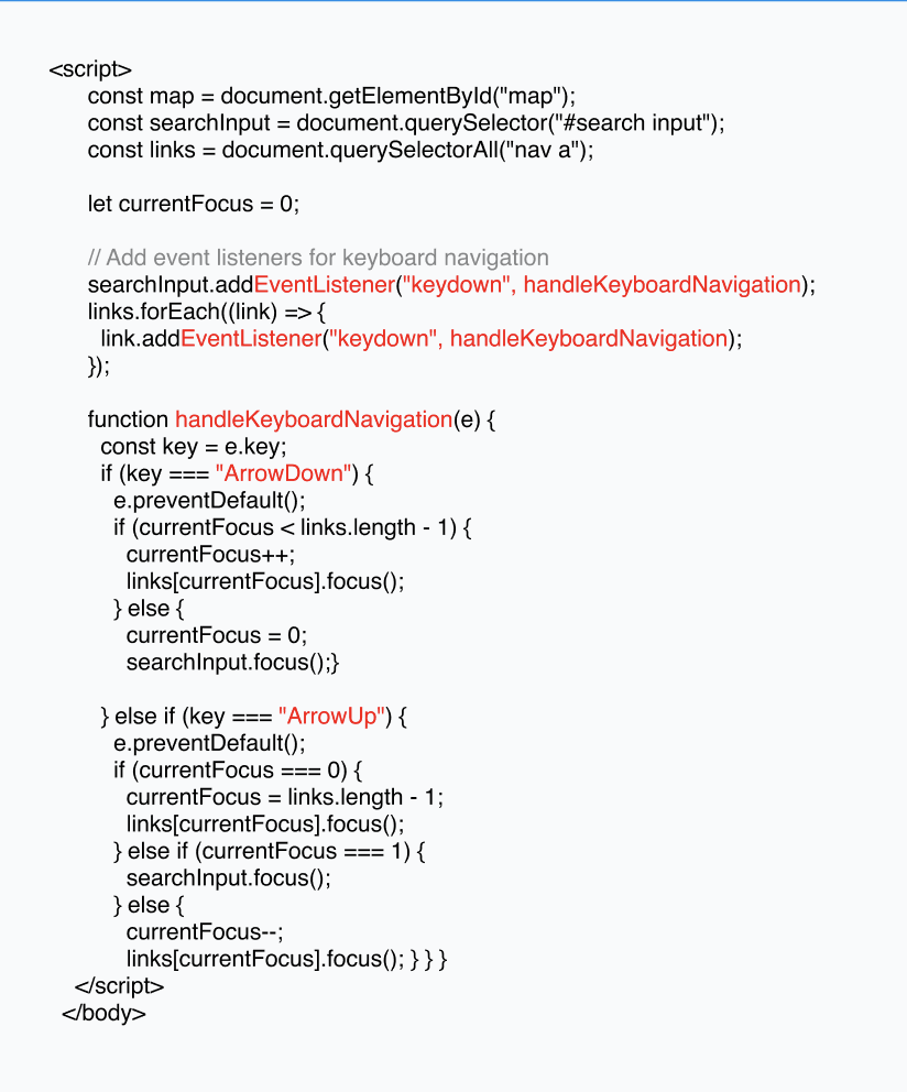
Throughout the development of this project, I implemented several optimizations to enhance the performance, maintainability, and accessibility of the codebase. Below are key strategies I used to optimize the design:
After multiple iterations and testing, the final version of the Eclipse Soundscape Map was launched. The final design resolved many of the pain points identified during research and significantly improved the user experience.